K33P
K33P is building a biometric recovery layer for self-custody. The brand had to explain a technical idea simply, feel secure without looking like a bank, and give the product a system it could grow with.
- Role
- Brand team lead
Founding contributor
- Scope
- Positioning
Visual identity
- Deliverables
- Brand system
Product direction
Applications
Read the case studyBack to visual view
Self-custody gives people control of their assets, but it also makes recovery difficult. K33P set out to replace fragile, handwritten seed-phrase backups with a product experience built around biometrics, encryption and user-controlled access.
The brief
The identity needed to make an unfamiliar security product understandable to people entering self-custody for the first time. It had to communicate protection and technical credibility without relying on the visual language of banks, padlocks and fear.
The idea
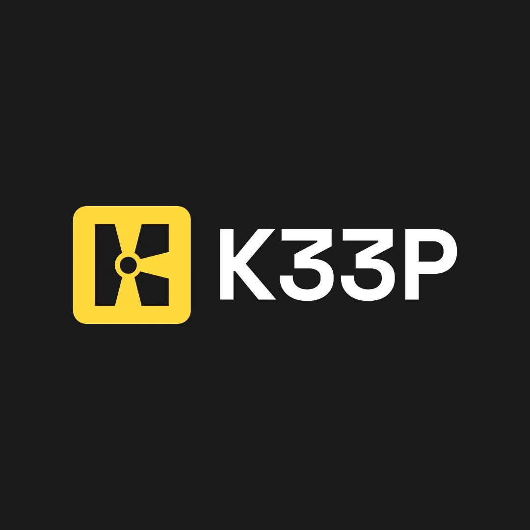
The system is organised around layered access. Three keyholes form both the “3” and a central “K”, creating a compact symbol for controlled entry and recovery. The idea extends into grids, vault-like perspectives and biometric waveforms.
The system
Electric yellow directs attention, deep black establishes authority and Sora keeps information clear across interfaces and physical applications. A supporting icon family gives complex security actions a consistent, recognisable form.
The application
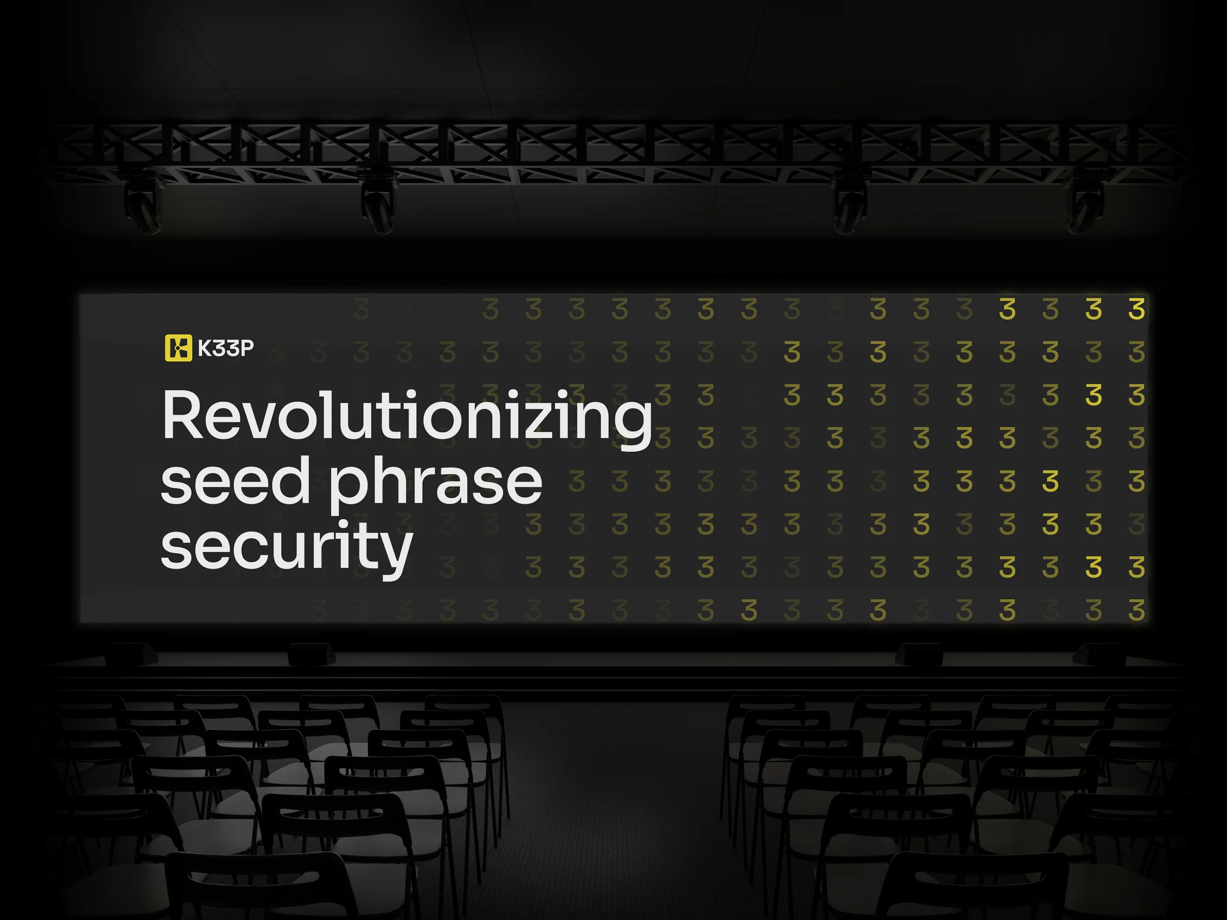
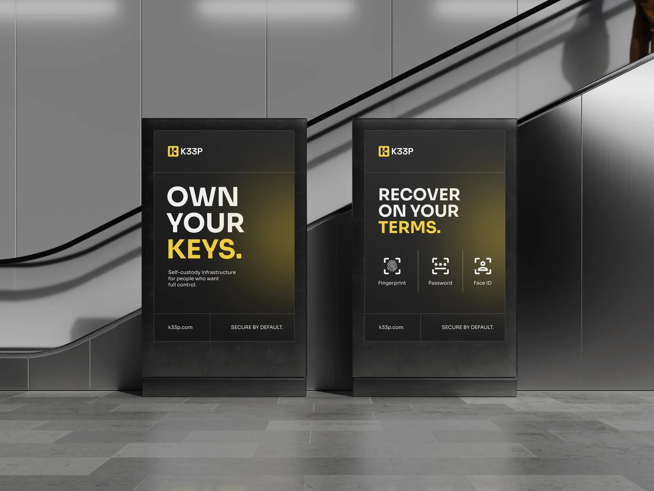
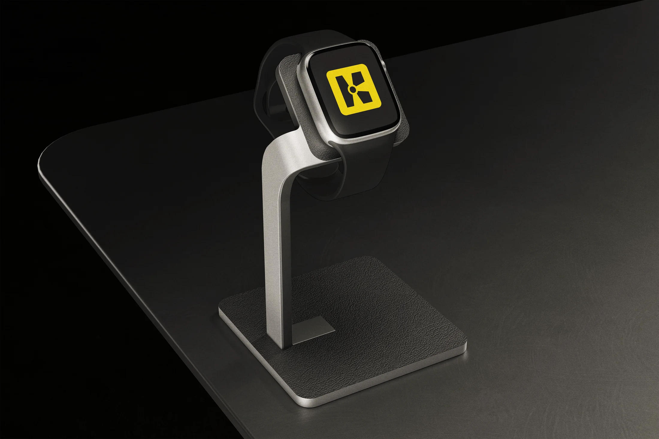
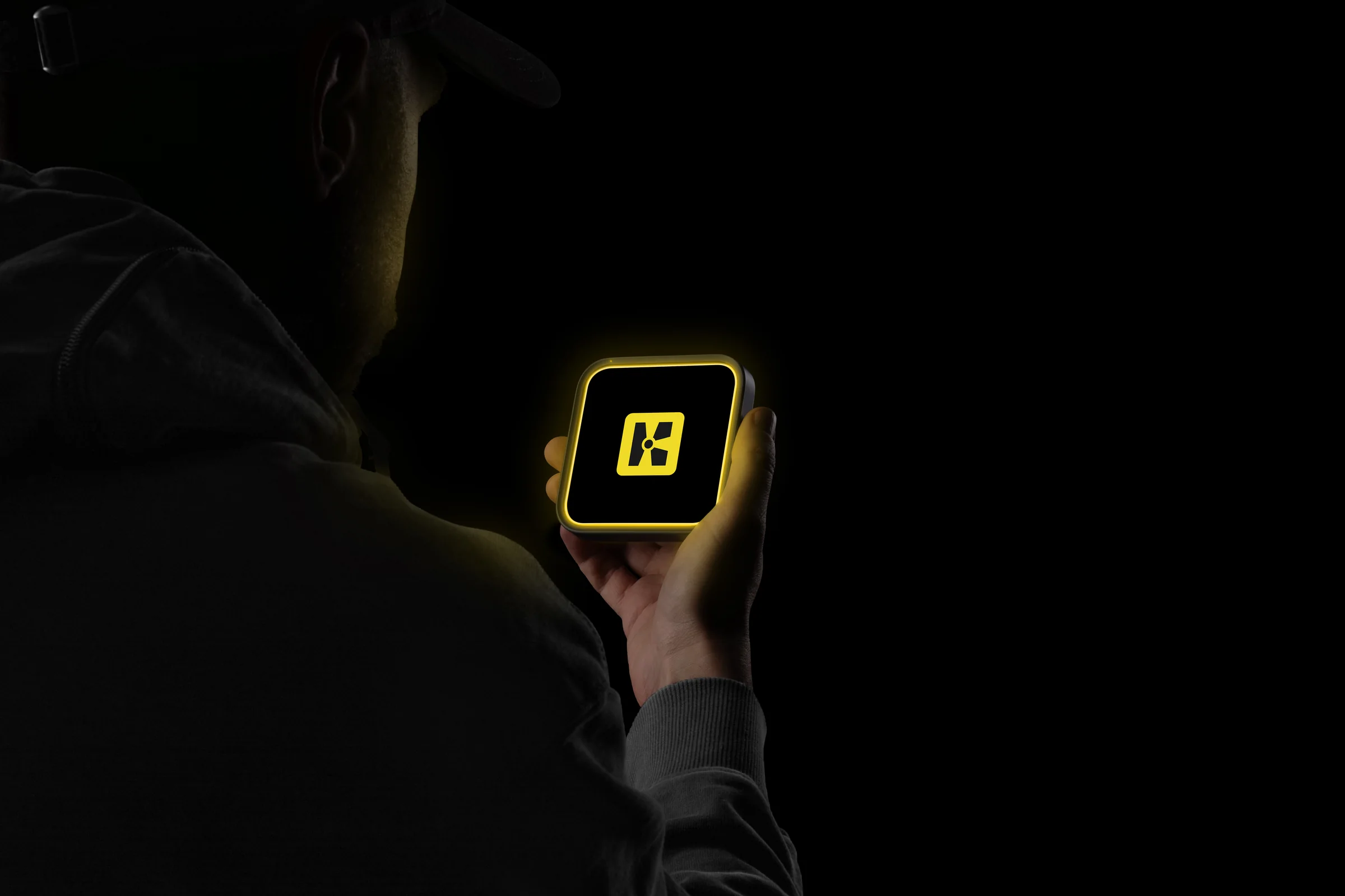
The identity was designed to move between a small product screen and a large event environment without changing character. Interface states, campaign messaging, signage, merchandise and investor material all use the same hierarchy and visual logic.
People choose self-custody because they want control. That control also comes with responsibility: if a seed phrase is lost, access may be gone with it. K33P needed to make this problem understandable without making the product feel frightening or overly technical.


Security, without the usual visual clichés.
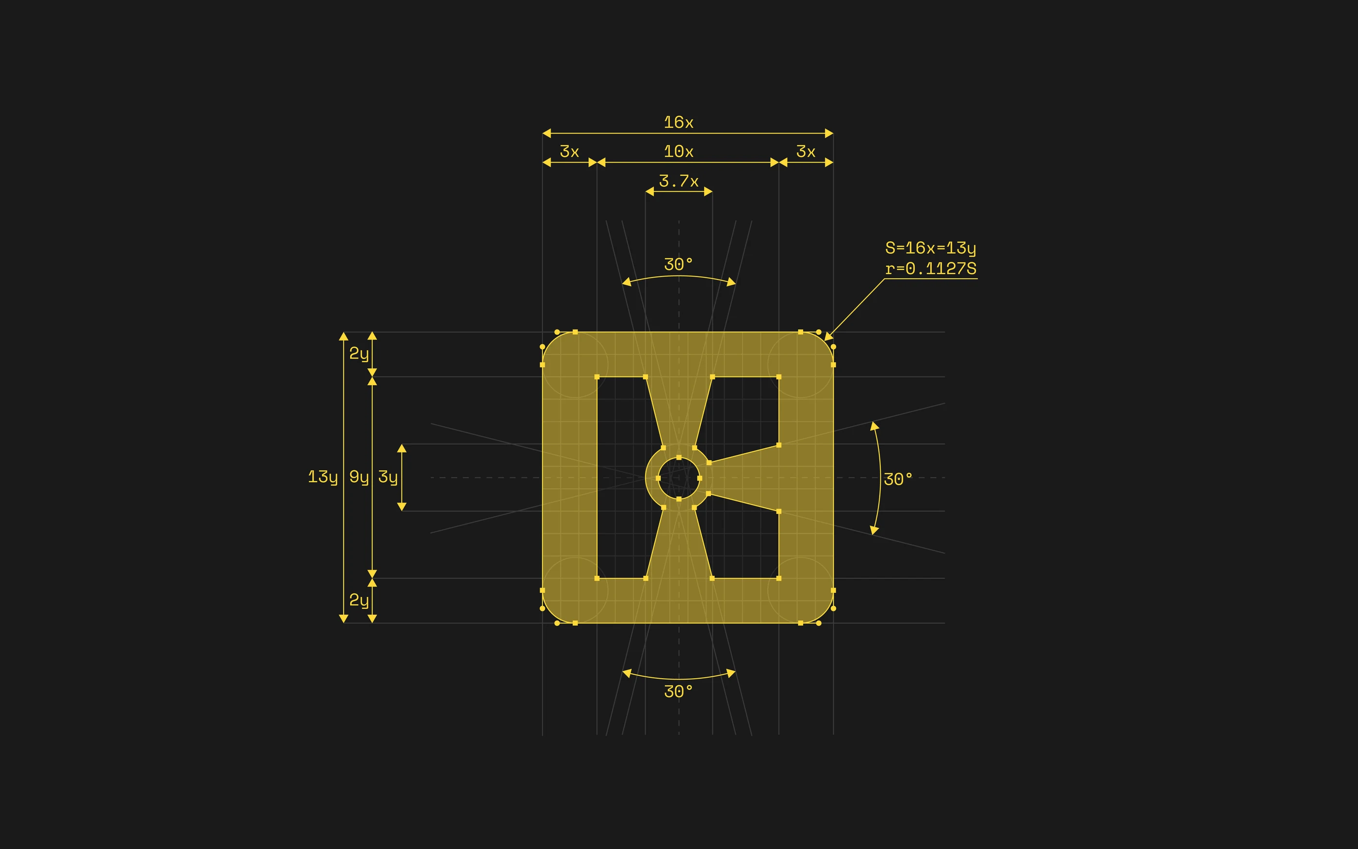
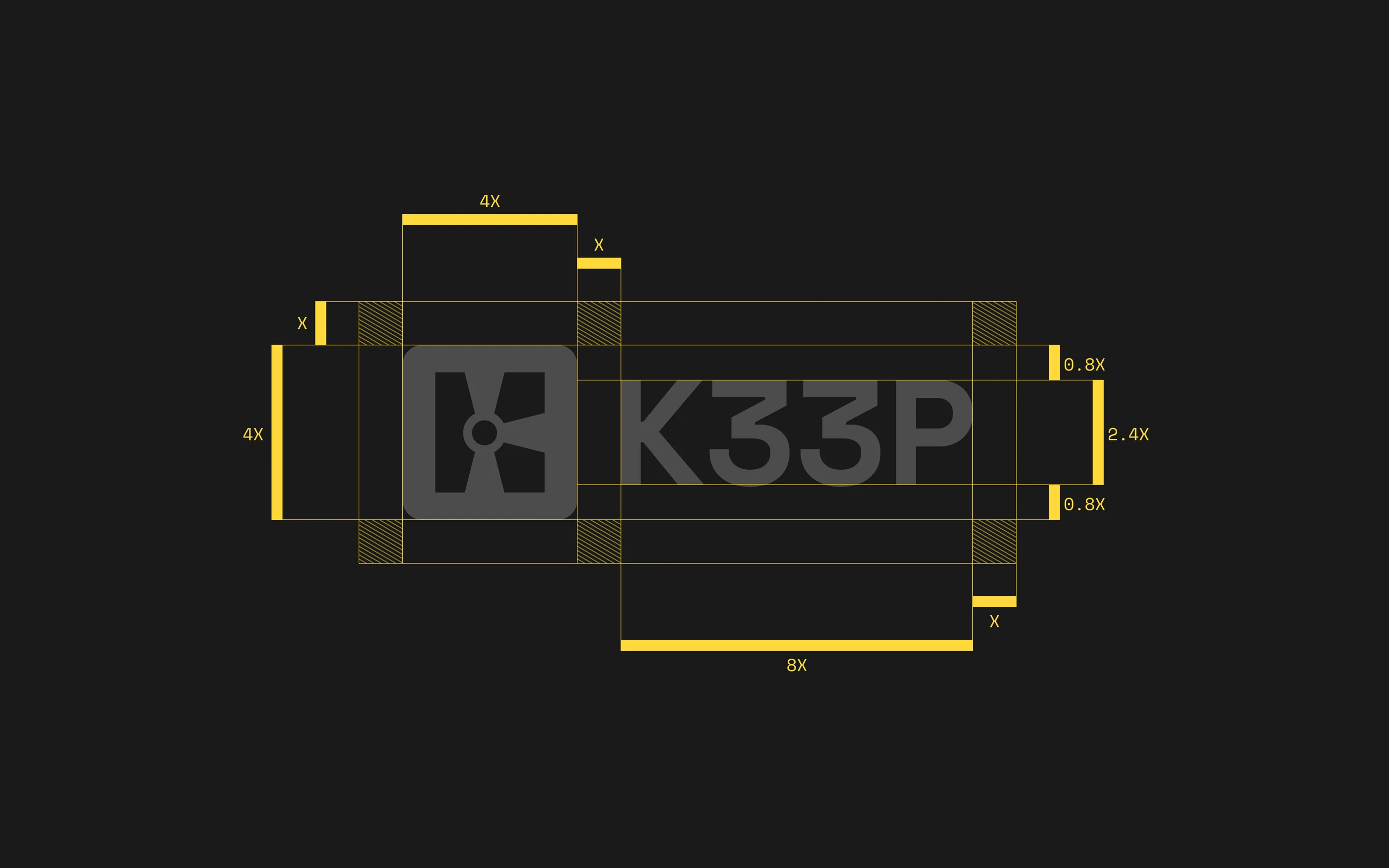
The mark is built from three keyholes. Together they form both a K and a vault-like mechanism, turning the product idea into something distinct and easy to recognise.
Your Crypto,
Your Control. Always.
The high-contrast palette makes important actions easy to spot. Yellow carries the energy and recognition of the brand, while black and white keep instructions, recovery steps and product information direct.


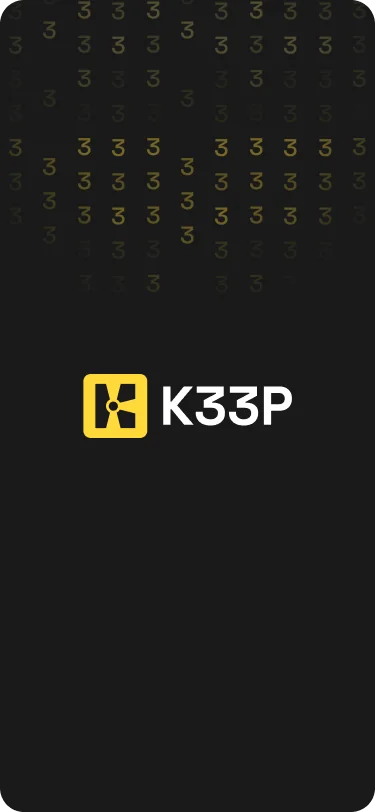
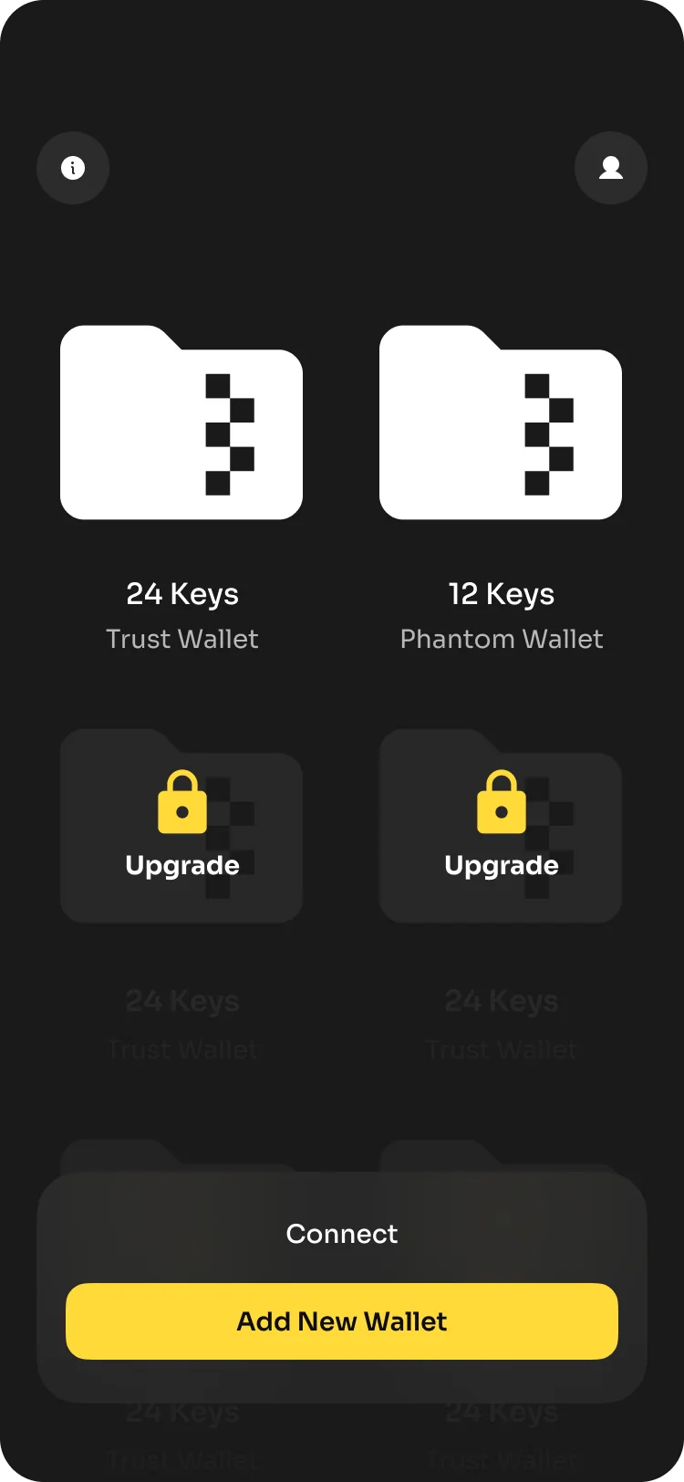
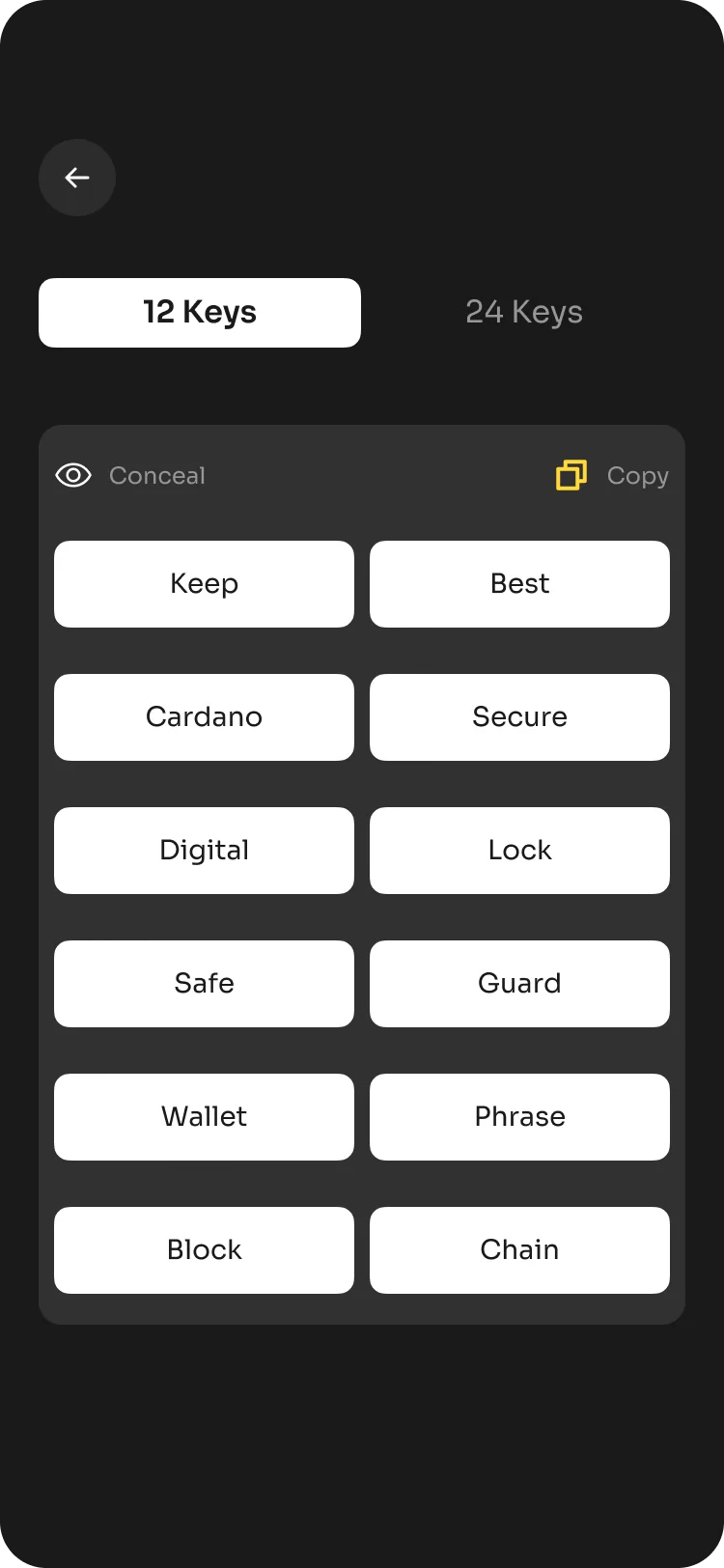
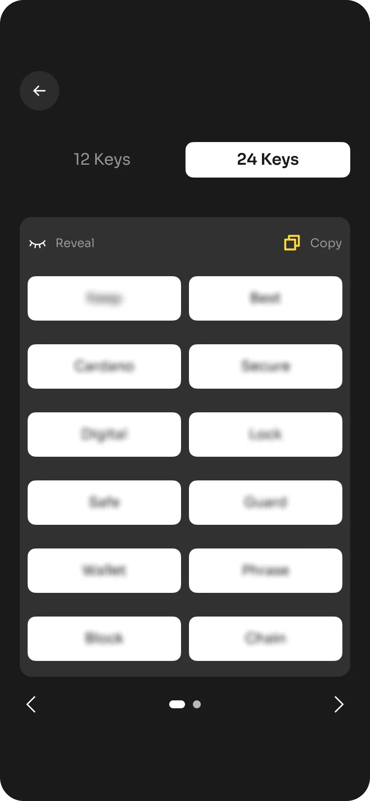
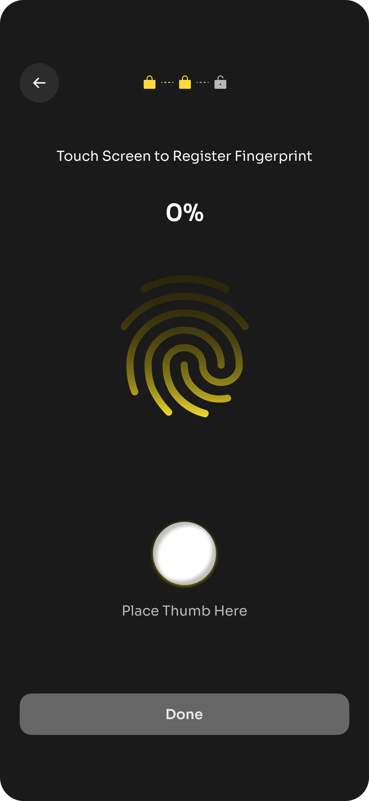
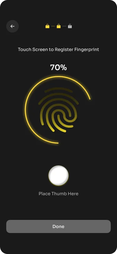
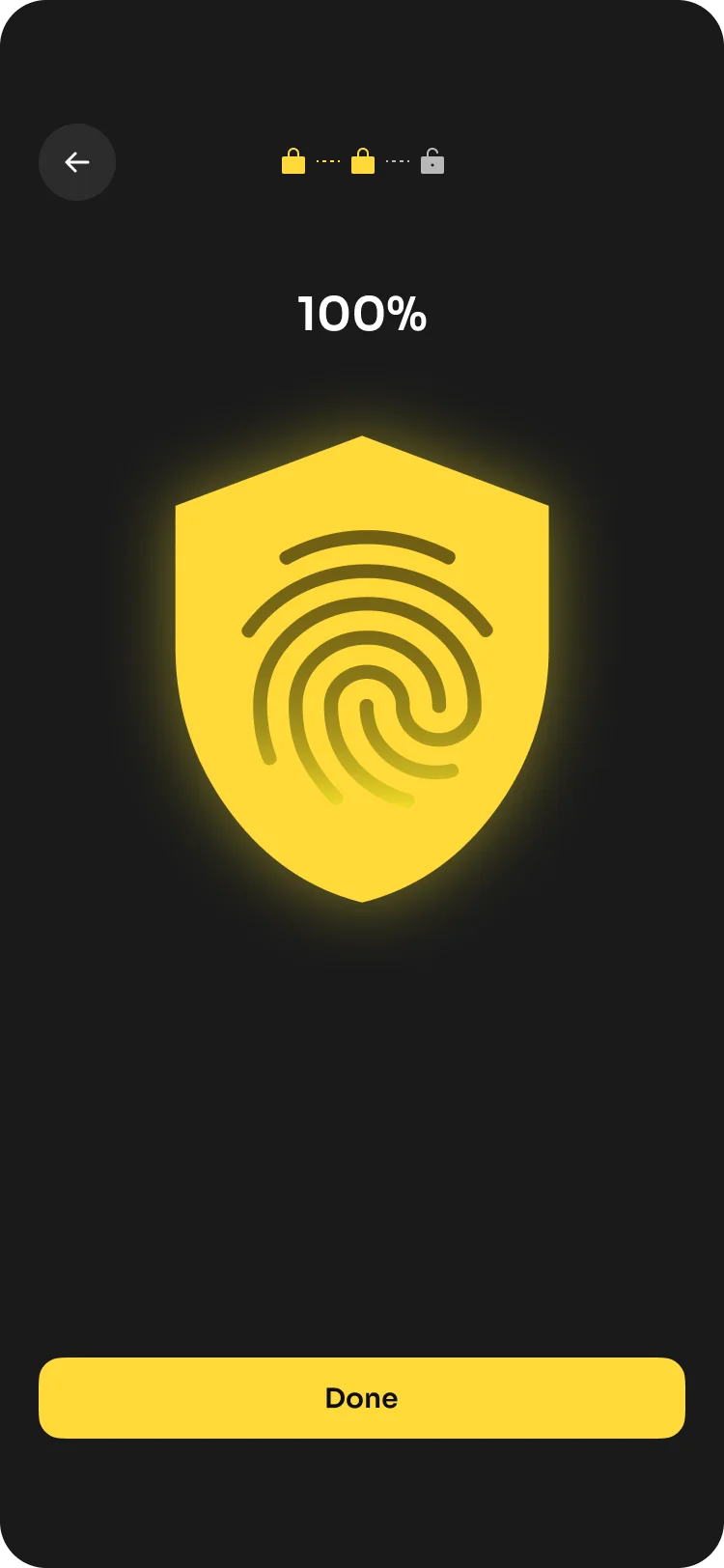
The product direction carries the same logic into the interface: one clear action at a time, familiar language and enough visual emphasis to help people understand when a decision matters.

Clarity also had to extend beyond the product.
The pitch deck brings K33P’s positioning, product mechanics and business case together. Each section helps investors understand the problem, see how the product works and follow the opportunity behind it.

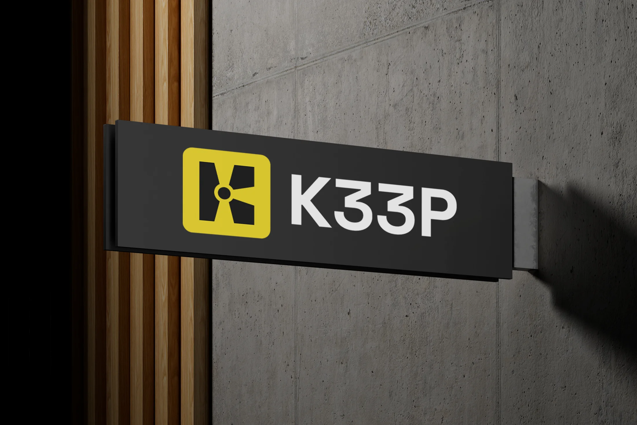
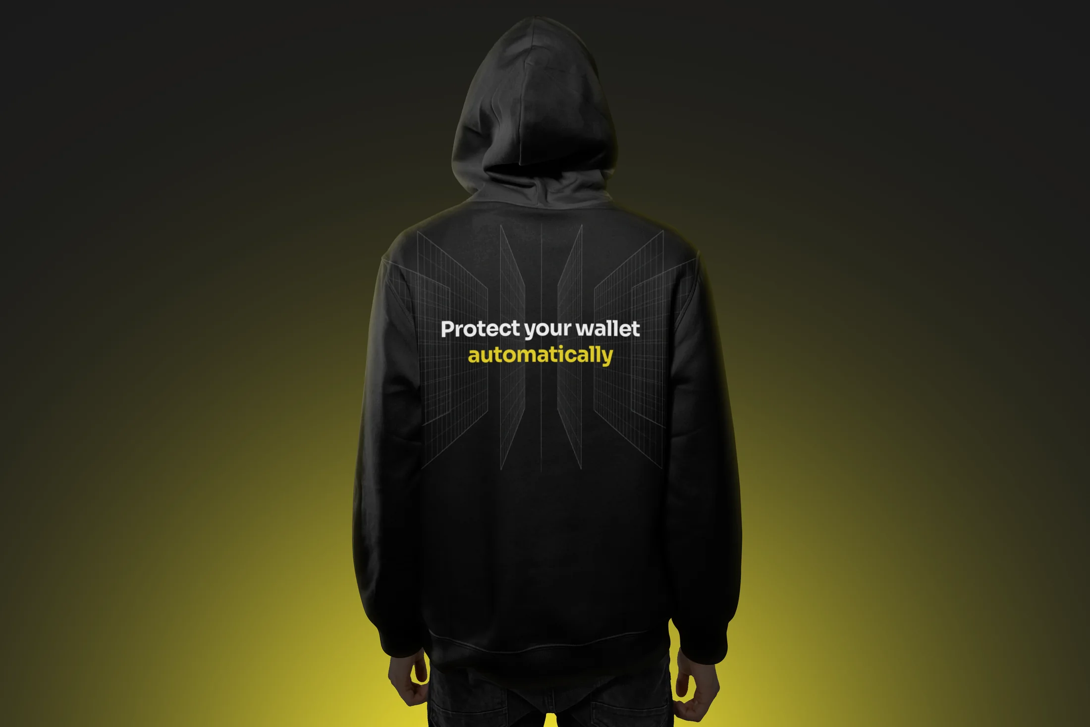
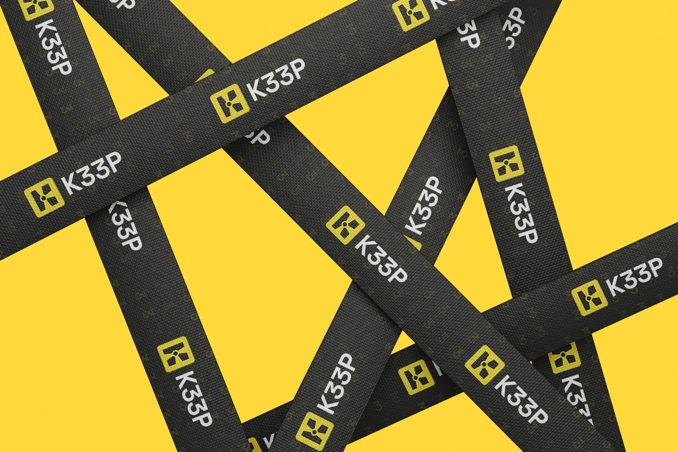
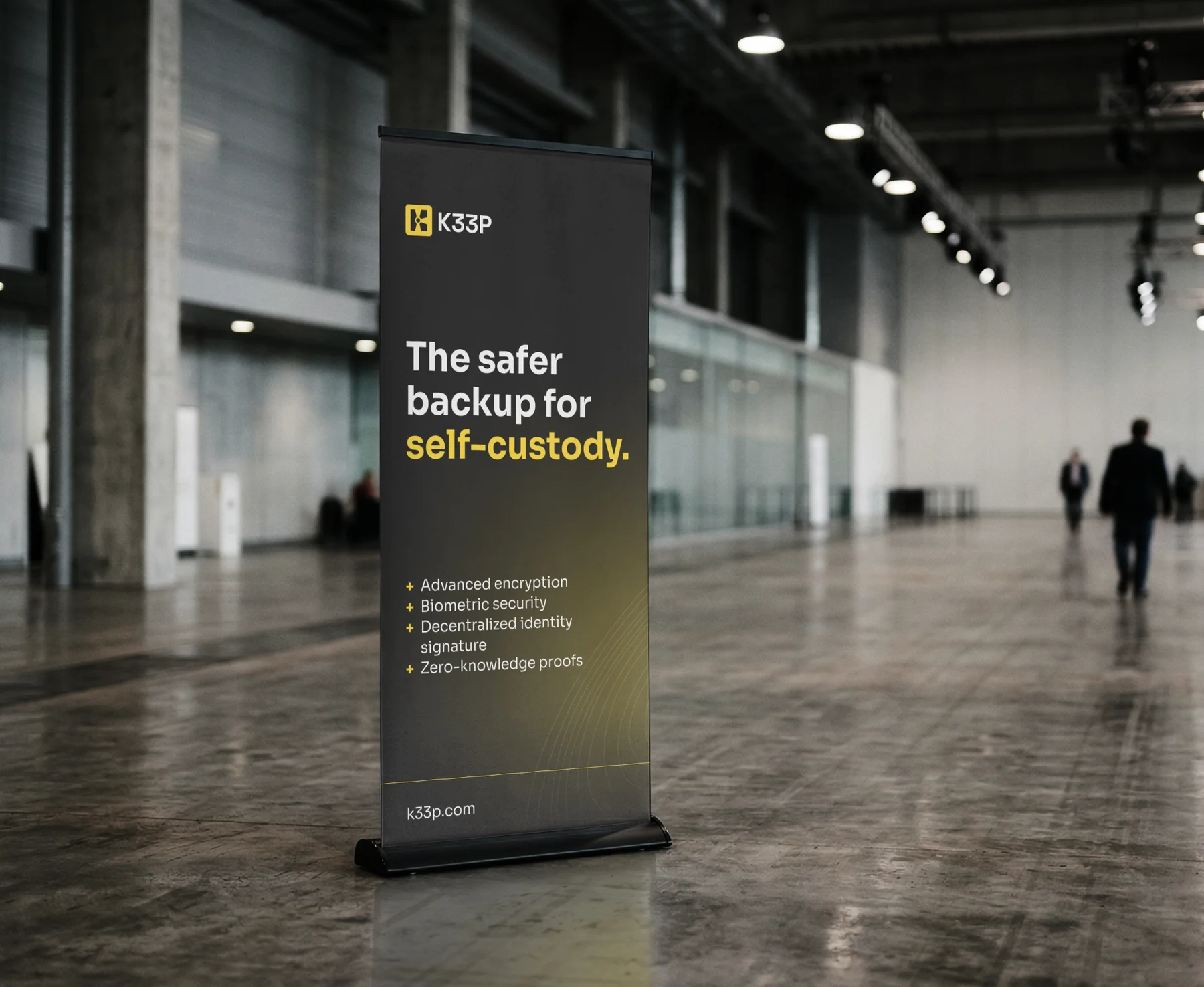
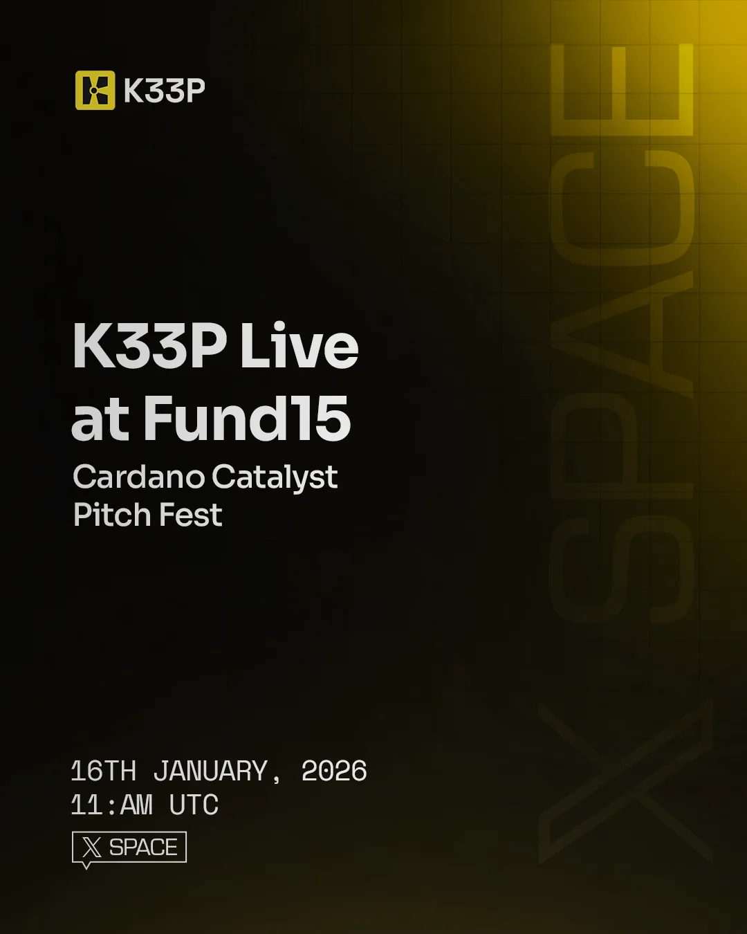
The result is a system that can move from a small product screen to a large physical space and still feel like the same brand: clear, direct and built around keeping control in the user’s hands.